Computer Sciences > 2020 > Bar Graph
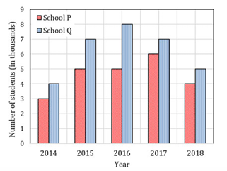
The following figure shows the data of students enrolled in 5 years (2014 to 2018) for two schools P and Q. During this period, the ratio of the average number of the students enrolled in school P to the average of the difference of the number of students enrolled in schools P and Q is
Correct : b
Similar Questions
A palindrome is a word that reads the same forwards and backwards. In a game
of words, a player has the following two plates painted with letters.
From...
Which number does not belong in the series below?
2, 5, 10, 17, 26, 37, 50, 64
Choose the word that is opposite in meaning to the word “coherent”.

Total Unique Visitors
Loading......